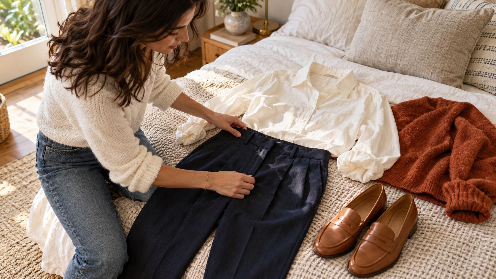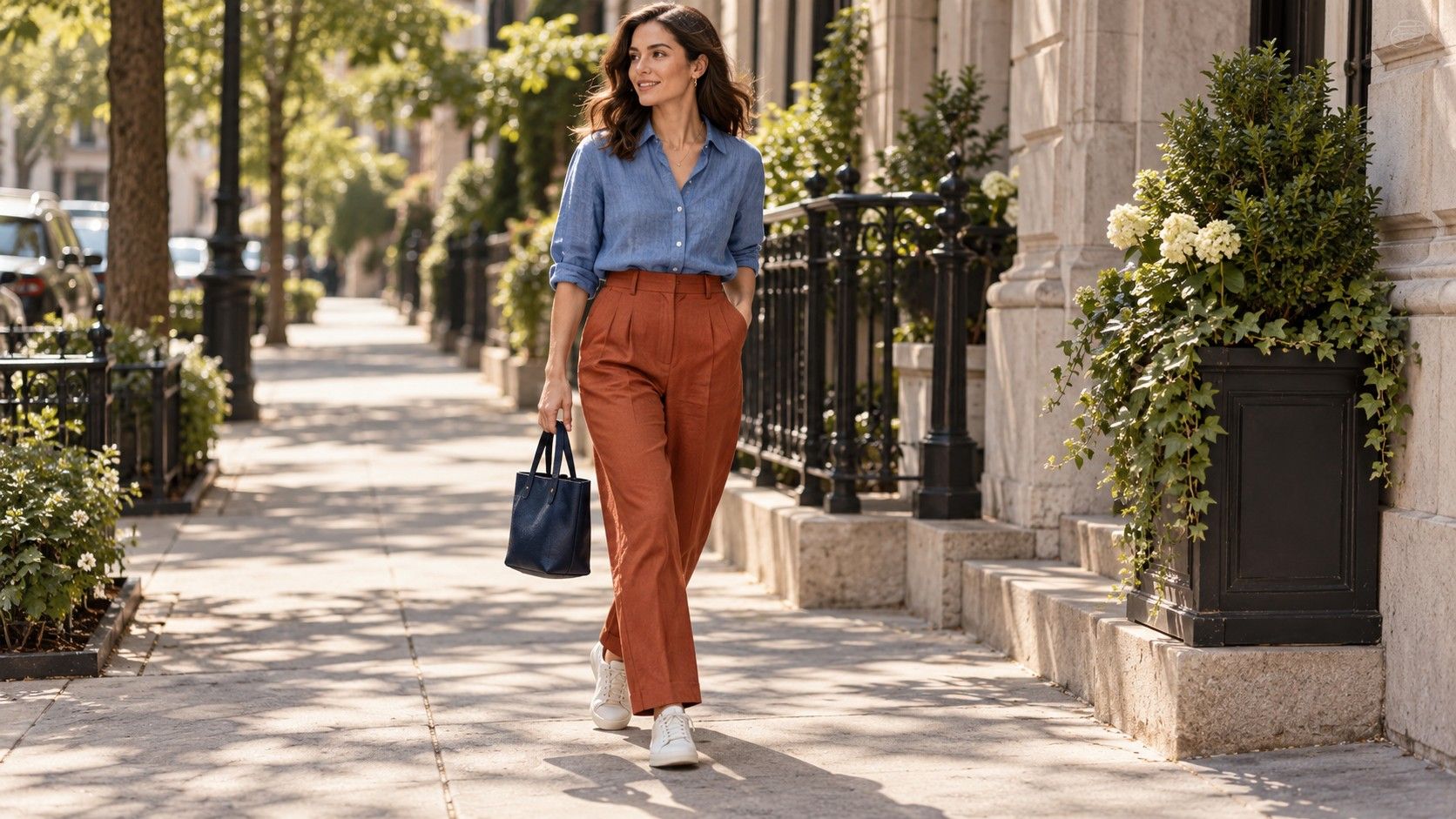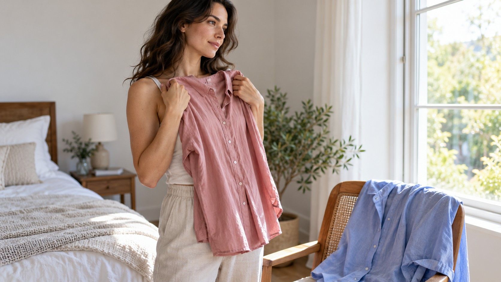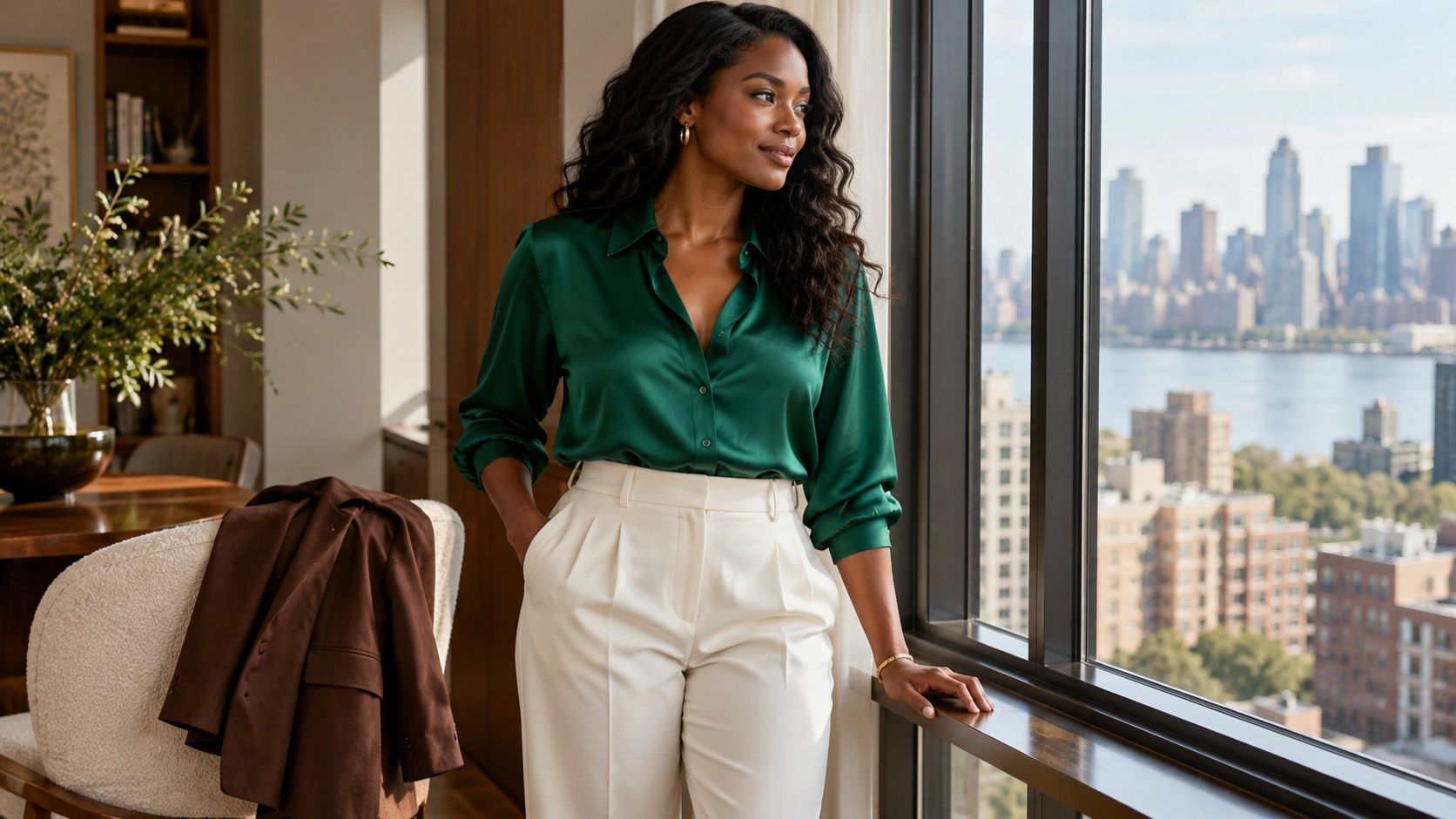
A bright shirt, a quiet brown knit, and a cream jacket can all belong in the same wardrobe. Advice for brown skin often concentrates on vivid colors and leaves the ordinary getting-dressed questions unanswered: which neutral goes with these trousers, how much contrast feels comfortable, and why does a familiar shade look different in satin? Skin depth is one part of the picture. Comparing actual garments gives you a more useful answer than a universal list, especially when you want clothes that work together through a normal week.
Separate skin depth from the color choices you enjoy
Brown skin covers a broad range of depths and appearances. It does not identify a single undertone, ethnicity, or seasonal palette. Two people with similar skin depth may prefer different versions of red, beige, or blue. Even one person may like the warmth of a rust sweater and the coolness of a blue shirt for different reasons. There is no inconsistency to fix.
Distinguish depth from temperature when comparing clothes. Depth describes how light or dark a color appears; temperature describes its relatively warm or cool character beside another shade. A light peach shirt and a deep terracotta shirt can both lean warm, yet their light-dark contrast against the face differs considerably. Similarly, dark navy and pale blue offer different effects despite sharing a broad color family.
Start by deciding the effect you want today. Perhaps you want a clear distinction between your collar and your complexion, or a soft tonal outfit with very little interruption. Both are legitimate. A jacket that stands out in a photograph may be pleasing for a celebration, while a low-contrast knit can feel right for a quiet workday. Personal preference is a useful decision criterion, not something to subtract from the process.
Compare a quiet neutral with a strong color in daylight
Take a familiar neutral top and a brighter alternative to a mirror near a window. Indirect daylight makes a practical starting point; stay out of direct sun, which creates pronounced highlights and shadows. Hold the garments at the same height below your chin, changing one at a time. Keep the background, makeup, and position similar enough to make the comparison useful.
Try cream beside white, chocolate beside taupe, or emerald beside muted green. Look at the overall arrangement: do you enjoy how the neckline frames your face, and does the garment have the amount of presence you want? Avoid treating every shadow or natural variation in your face as a problem to correct. You are choosing clothes, not evaluating the quality of your skin.
If the result is unclear, change one property. A cobalt top may feel too bright, but a deeper blue could be exactly right. A taupe sweater may feel too close to your complexion, while a lighter stone or deeper brown gives the separation you prefer. This kind of adjustment is more informative than deciding that all neutrals or all jewel tones are unsuitable.
Warm changing-room lighting can make subtle comparisons difficult. If a piece is expensive and its appeal depends on a precise beige or pink, check it near the shop entrance if permitted, or consider an at-home comparison under the seller's return policy. The label on the hanger cannot tell you what that particular dye looks like beside your other clothes.
Build a neutral outfit with intentional differences
Tonal dressing is especially useful when you want a coordinated outfit without matching every item exactly. Try cocoa trousers, a lighter brown shirt, and a dark chocolate jacket. The changes in depth give each piece a place. Choosing all three in similar mid-brown shades may create a flatter effect; you might love that, or prefer a clearer division at the waist and neckline.
Texture helps distinguish neighboring colors. A ribbed caramel sweater over smooth brown trousers looks deliberately layered, even when the colors are close. A suede-look bag and polished shoes can add further variation. Check the whole arrangement from a few steps back, where small material differences become less obvious. If everything merges more than you intended, add one lighter or darker piece.
Black, charcoal, navy, cream, and gray are equally available as neutral bases. A black top against brown skin can create a softer light-dark difference than a white top, depending on the individual's skin depth and the actual fabric. Neither needs to produce maximum contrast to be successful. Think about the mood of the outfit and the practical pieces you already own.
Keep the shoes in the conversation. Cream trousers and a cocoa top may be easy to finish with brown loafers, while dark denim and a gray knit may work with your usual black boots. A theoretical palette has limited value if it repeatedly requires footwear you would never choose for the commute.
Let one jewel tone carry a work or evening outfit
Emerald, sapphire, ruby, and amethyst describe rich color families rather than exact shades. They are promising options when you want an accent with depth, but they are not compulsory clothing for brown skin. Try a green blouse with navy trousers, a blue knit with charcoal, or a deep purple shirt with black jeans. Keep the surrounding pieces familiar while you assess the new color.
For a work meeting, a matte berry blouse under a navy jacket offers a different level of attention from a glossy bright-red blouse. At dinner, you may prefer the second effect. Color depth, shine, neckline, and the amount of visible fabric all contribute. A color that felt loud as a full dress might be a favorite as a narrow scarf or small bag.
With prints, inspect the color at the collar as well as the dominant color across the garment. A blue-and-cream patterned shirt may frame the face mostly in cream, depending on where the pattern falls. Compare a small print with a large one from a distance. There is no need for every printed shade to belong to one seasonal category if you like their combined effect.
Allow accents to vary through the week. You can wear turquoise with denim on Saturday and choose a quiet oatmeal knit on Monday. The point is to give yourself usable alternatives, not to maintain a constant level of brightness because an online chart says it is flattering.
Adjust pale colors and brights through area and finish
Pale yellow, light pink, and soft lilac can create noticeable contrast against deeper skin, while their exact effect still depends on shade and context. If a pastel top feels too prominent, wear it beneath an open dark jacket. If it feels too faint, try a clearer or slightly deeper version. A washed lavender tee and a crisp lilac shirt can be surprisingly different choices.
White deserves the same attention as any other color. Compare brilliant white cotton with soft white linen and a yellowish cream knit. The fabric finish and color both change the impression. A stiff white collar has a sharper outline than a relaxed open cream shirt. Choose for the outfit you are making rather than assuming one white is universally best.
Neon or very clear colors can be enjoyable when you want them, but skin depth does not oblige you to wear them. Reduce a bright orange to a bag, choose a deeper orange knit, or pair the original top with dark denim. Likewise, moving a difficult shade to trousers puts more distance between it and your face while keeping it in the outfit.
Buy the piece that completes real combinations
When researching brown skin tone colors to wear, bring the decision back to two complete outfits. Before buying a teal shirt, name the bottoms, shoes, and outer layer you will wear with it. Then plan a second combination for a different setting. This exposes the lovely garment that works only in an imagined wardrobe.
Check the outfit sitting down and with the jacket fastened as well as open. Notice whether the collar remains comfortable and whether a pale fabric is more sheer than you expected in window light. These ordinary details often decide how much use the piece gets, regardless of how appealing its color looked on the rail.
There is no need to divide these color comparisons into separate rules for women and men. Record what you actually liked: cream with navy, emerald with charcoal, cocoa with caramel. A short personal list and a few outfit photos are enough to guide another purchase, with room left for a color you simply want to wear.