A color wheel is useful when two good pieces refuse to make a convincing outfit. It gives you a few relationships to try, then your actual clothes supply the answer. A faded blue shirt, rust trousers, and cream trainers behave differently from three flat patches on a screen. Start with a real reason to get dressed, choose one garment you want to wear, and use the wheel to find a partner rather than a whole new wardrobe.
Choose the garment that has to work today
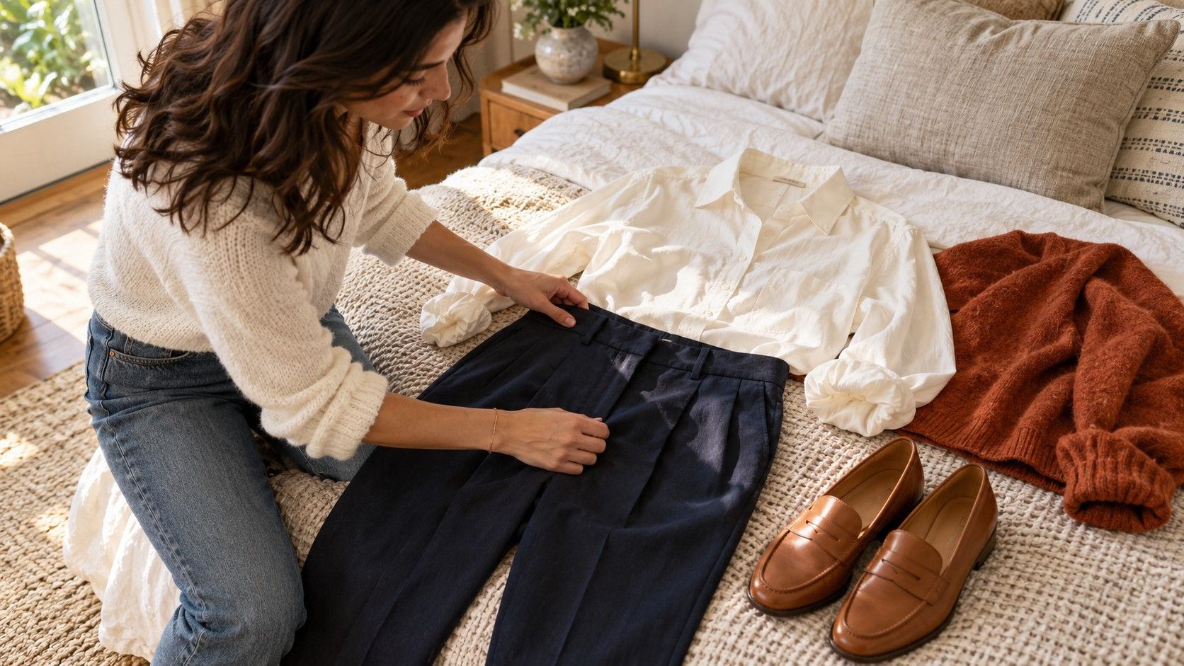
Before looking for a color wheel for clothes, put the practical limits on the bed: the trousers comfortable enough for the commute, the jacket needed for rain, or the shoes you can stand in all evening. One of these will usually set the direction. If the fixed piece is a navy suit, your decision may be about a shirt and scarf. If it is a bright green skirt, you have a more visible color relationship to manage.
A basic clothing color wheel places red, orange, yellow, green, blue, and violet around a circle, with intermediate hues between them. It shows the relationship between color families. It does not show every beige, denim wash, or shade of brown in a wardrobe. Treat those garments as specific colors you can compare, not mysterious exceptions that need a separate rule.
Pick the mood you want as well as the occasion. Similar colors can feel settled; opposites can make a small detail more noticeable. Neither choice automatically makes an outfit formal, casual, flattering, or fashionable. A blue cotton shirt with green trousers can be quiet enough for a meeting when both are dark and subdued. The same families in glossy turquoise and lime create a different impression.
Use neighboring colors when you want an easy morning
Analogous colors sit near one another on the wheel. Blue with blue-green, or rust with warm burgundy, gives you a relationship that is often easy to repeat. For a first attempt, use two neighboring families and let a neutral occupy the remaining space. Try a muted teal knit, navy trousers, and charcoal shoes. The garments connect without requiring an exact match.
Do not assume that neighboring hues need identical intensity. A pale blue shirt can sit comfortably under a dark green cardigan. Check the lightness difference, sometimes called value contrast: can you still read the edges of the shirt, knit, and trousers from across the room? If everything merges more than you want, add a lighter neckline, a darker belt, or shoes with a clearer edge.
For an autumn combination, lay a terracotta top beside a burgundy skirt before adding a camel coat. The coat may pull the whole outfit warmer, which could be exactly what you like. If it feels heavy, try a pale oatmeal knit instead of changing all three pieces. One adjustment is easier to judge than a succession of complete outfit changes.
Patterns complicate the circle in a useful way. A checked shirt containing navy and green already joins those neighbors. Echo either color in plain trousers and keep the other visible in the print. There is no need to add a third related color simply because the wheel has room for it. Small prints may blend into a different overall color at a distance, so take a few steps back.
Keep opposite colors manageable with unequal amounts
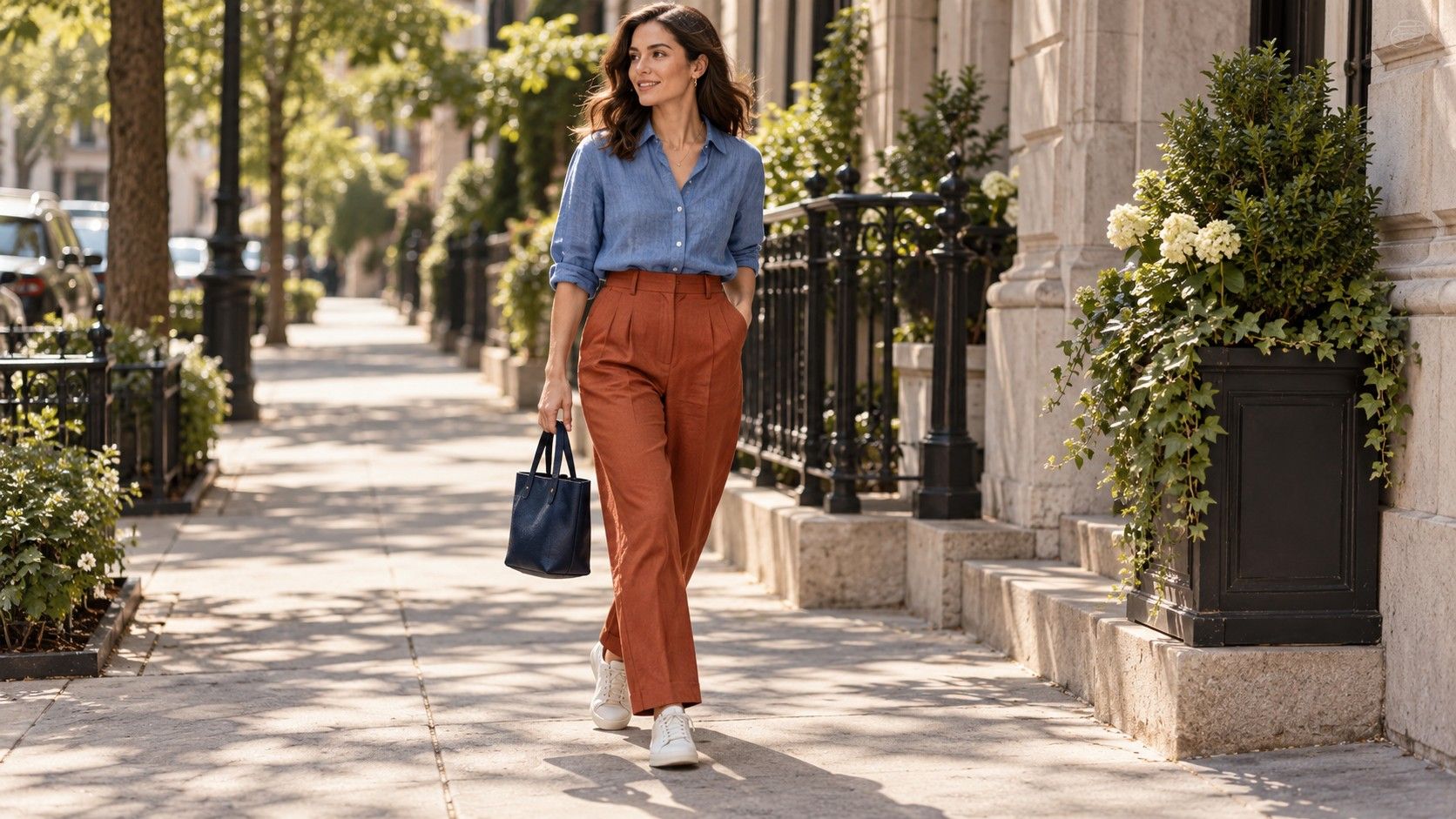
Complementary colors lie opposite one another: blue and orange, red and green, or yellow and violet on a typical artist's wheel. Clothing shades rarely match these ideal points precisely. Navy with a rust belt can suggest the blue-orange relationship without looking like a costume. The useful idea is contrast between families, not finding the purest possible orange.
Begin with an accent if you are unsure. Wear dark blue denim and a navy knit, then add a burnt-orange scarf. The blue covers most of the outfit and the scarf gives the eye a place to land. For red and green, a burgundy bag against a muted olive coat can feel gentler than a bright red jumper with emerald trousers. The difference comes partly from saturation, the intensity or vividness of each shade.
Equal areas of two bright opposites can feel busy, especially when the clothes also have strong shapes or prints. That is a valid choice for a party; it may be distracting for a presentation where you want attention on your face. Reduce the area of one hue, soften one shade, or place a plain neutral between them. A cream shirt can separate an orange jacket from blue trousers without erasing the contrast.
| Piece you already own | Relationship to try | Small first experiment |
|---|---|---|
| Navy trousers | Blue with orange | Rust scarf with a cream top |
| Olive jacket | Green with red | Burgundy bag over a charcoal outfit |
| Violet knit | Violet with yellow | Muted ochre shoes and dark denim |
| Blue-green shirt | Neighboring blue and green | Navy trousers with gray shoes |
Check the shades in daylight before blaming the wheel
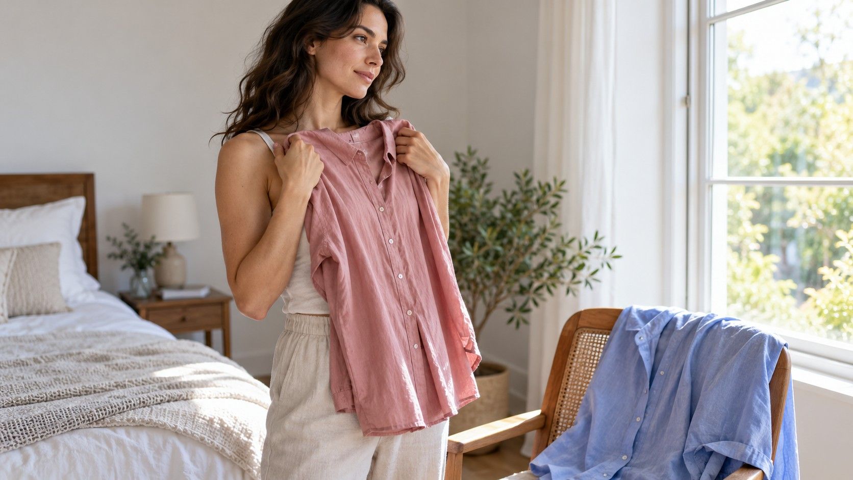
A combination can make sense on paper and still feel wrong in the mirror. Put the actual garments beside each other near a window, away from direct colored reflections. Warm indoor bulbs may make cream look yellower and blur a subtle difference between browns. Daylight is a useful reference, though the final check should include the lighting where you will actually wear the outfit.
Compare similar areas of fabric. A small folded corner of pale pink can disappear beside a whole emerald coat, giving a misleading impression of their balance. Hang the top over the trousers or wear both. Then check the neckline with your usual hair, glasses, and makeup if you wear it. Personal preference matters more here than a claim that a particular combination is universally correct.
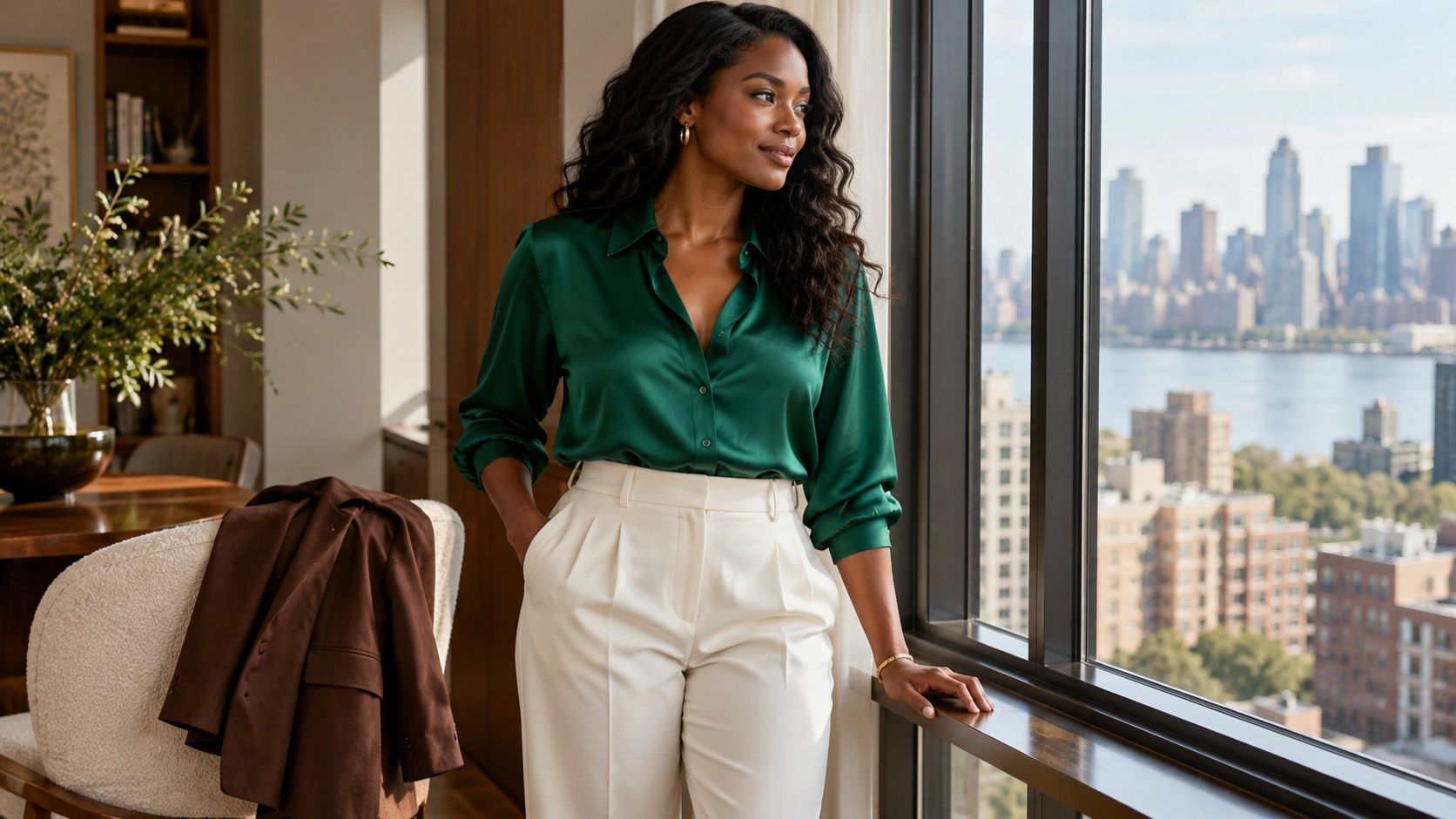
Fabric finish changes the result. Satin catches light and can make a color more prominent; brushed wool tends to scatter light differently and may look softer. A shiny emerald blouse can dominate matte navy trousers despite the neighboring color relationship. If you enjoy the hues but dislike their balance, try a textured knit in the same family before deciding the colors cannot work together.
A phone photograph can help you remember combinations, but automatic exposure and white balance may shift their appearance. Use the photo to compare proportions or the overall light-dark pattern. Make the final color judgment with your eyes on the clothes. If a fabric changes noticeably as you turn, inspect it in several positions rather than trusting a single straight-on view.
Repair a nearly right outfit before buying another piece
When the outfit feels unsettled, identify what bothers you in ordinary terms. Is the scarf the first thing you see when you wanted a quiet look? Do the top and trousers merge? Does the tan belt introduce a warm stripe into a combination you preferred without it? These questions lead to a small repair. Saying that the colors clash can hide several different problems.
Try proportion first. Tuck a bright top into high-waisted trousers to reduce its visible area, or open a neutral jacket over it. Roll a sleeve to repeat a pale shirt at the cuffs. Shoes can ground a look through depth even when they do not repeat the main hue. Black boots under burgundy trousers may feel more connected to a dark jacket than pale shoes would.
Then check the neutrals. White can look crisp, cream can soften a transition, and charcoal can lower the overall lightness. These are visual possibilities rather than fixed outcomes: a particular cream may look too yellow beside your lilac shirt. Move two alternatives into the outfit and compare them directly. Keeping the rest constant makes the difference much easier to see.
Save two or three combinations that work with your existing wardrobe. Note the actual items, including the shoes, rather than writing only “blue and orange.” Before buying another color, check whether it makes a complete outfit with at least two things you wear regularly. A wheel can suggest a direction; a repeatable outfit, comfortable enough for an ordinary day, is the more useful result.