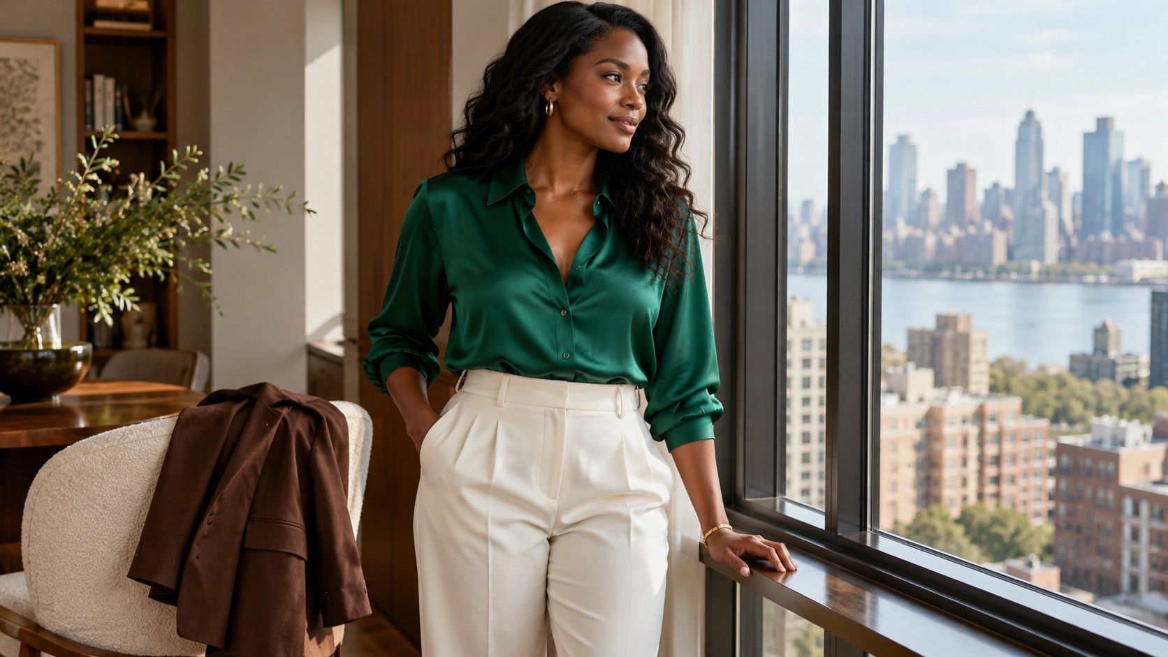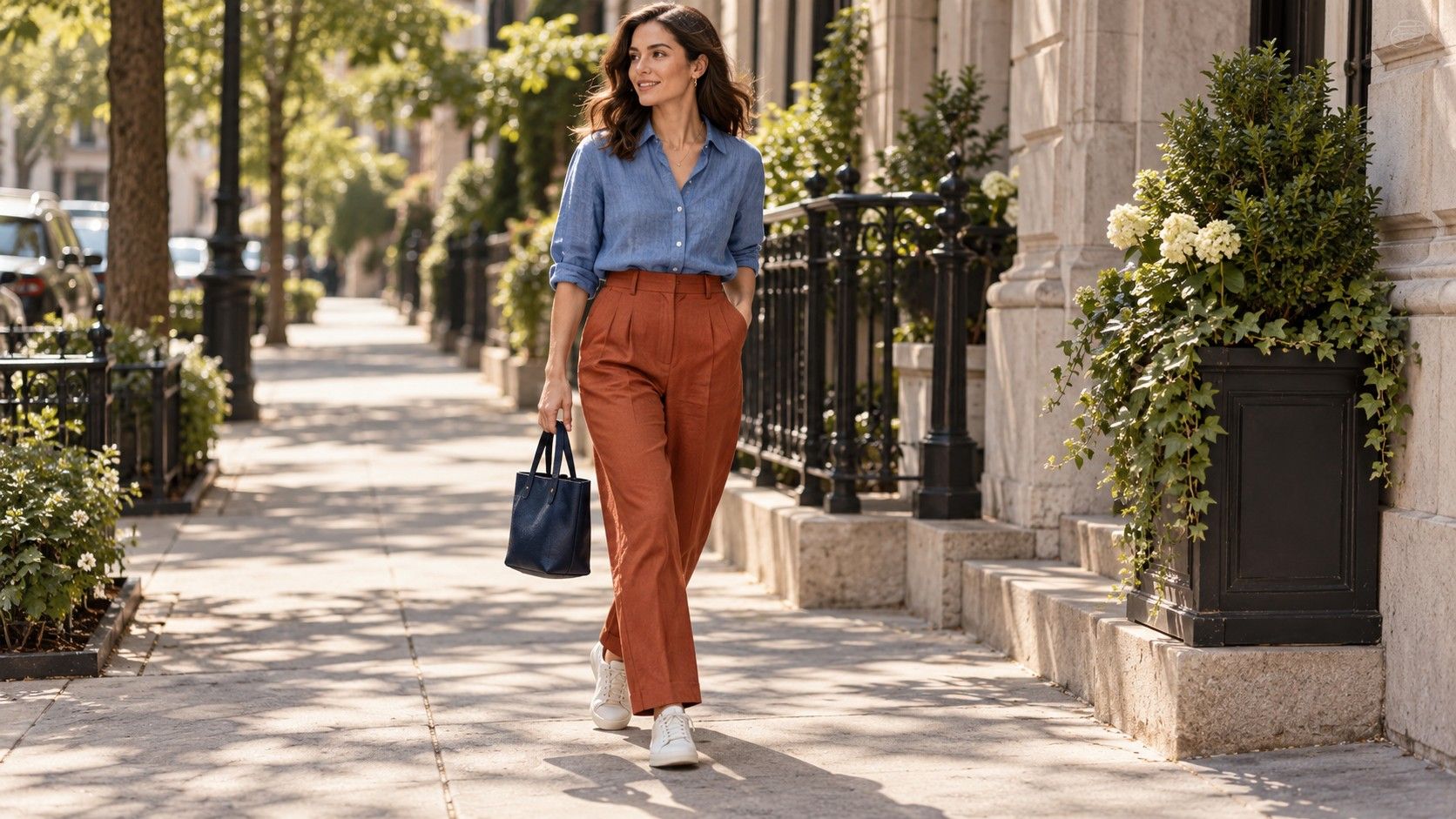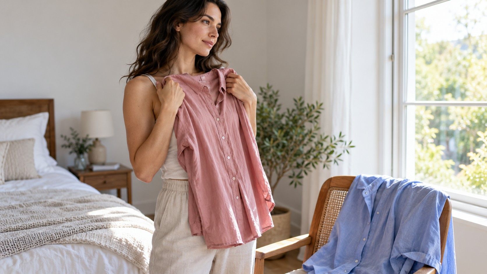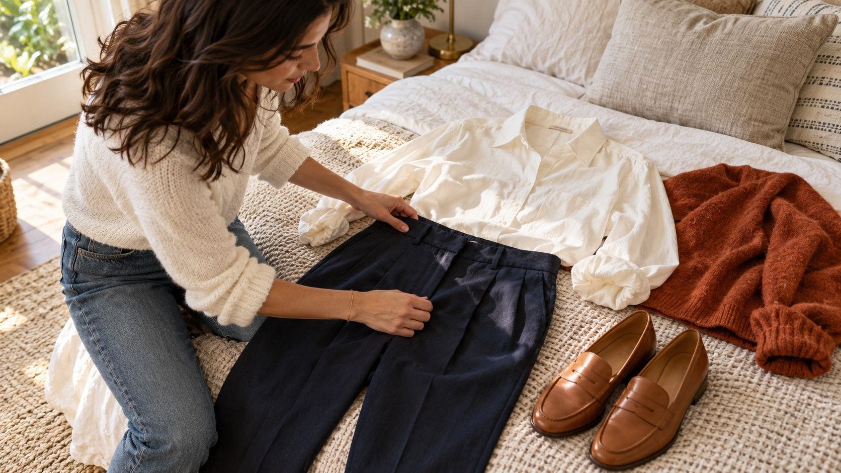
A color chart for clothes is most useful when it starts with the piece already lying on your bed. Navy trousers need a shirt and shoes; a green skirt needs a top you feel comfortable wearing. The chart below gives you a few starting combinations, then shows how to adjust them for pale versus deep shades, shiny versus matte fabrics, and the amount of each color visible. Treat the pairings as invitations to try an outfit, with room for your own taste.
Find the base piece you actually need to wear today
Choose the garment that is hardest to change: work trousers, a coat suited to the weather, or the dress you bought for an event. That becomes your base. It does not have to be a neutral. Burgundy trousers can anchor an outfit just as effectively as gray ones if you enjoy wearing them and have useful partners in the wardrobe.
Look at the actual shade before using its color name. Navy can lean toward purple, green, or almost black. Beige might be pinkish, yellowish, or closer to gray. Lay the base garment beside a white sheet of paper and another familiar item to make the differences easier to describe. You do not need a precise technical label; “a slightly green gray” is enough to guide a comparison.
Next, choose the effect you want. A pale shirt against deep trousers creates a distinct division, while similarly deep colors produce a more continuous outline. Neither is a requirement for a particular body, gender, or age. Think about whether you want the top, the whole outfit, or a smaller accessory to draw attention, then use the chart to narrow the options.
Use this chart to pull two possible partners from the wardrobe
Start with the quiet pairing if you need to dress quickly. Try the stronger pairing when you want more color or have time to compare. Each row offers a complete direction, rather than a promise that every garment bearing those color names will look identical.
| Base garment color | Quiet partner | Stronger partner | Detail to check |
|---|---|---|---|
| Navy | Soft white or light gray | Rust or bright pink | Very dark navy may blend into black shoes |
| Charcoal | Pale blue or ivory | Burgundy or clear green | A matte top can soften a sharp trouser fabric |
| Beige or camel | Cream or chocolate | Deep blue or tomato red | Pink beige and yellow camel give different results |
| Chocolate brown | Oatmeal or soft blue | Turquoise or orange | Compare the partner with the actual brown in daylight |
| Olive green | Ecru or washed denim | Coral or violet | A muted olive may need less bright color than expected |
| Burgundy | Gray or cream | Pink or mustard | Start with a small area of the second strong color |
| Black | Charcoal or white | Cobalt or red | Check whether two black fabrics match closely enough for you |
| White or ivory | Sand or pale gray | Green or deep blue | Check fabric opacity as well as the color pairing |
Pull only two tops for the first comparison. With olive trousers, that might mean an ecru T-shirt and a coral knit. Try both with the same shoes so the decision stays manageable. If neither feels right, change the depth of the top before abandoning the combination: a dusty coral and a luminous coral can create very different outfits.
When the listed colors clash, check depth and intensity first
A chart cannot show every version of blue or orange. A bright cobalt shirt with bright orange trousers makes a much louder combination than washed blue denim with a rust sweater. Both belong to broadly similar color families, yet the contrast and intensity are different. If an outfit feels too busy, keep one color and choose a softer or darker version of the other.
Depth is the difference between a pale tint and a very dark shade. Lay the garments flat and step back: can you clearly see the edge where they meet? A light cream top against navy has an obvious boundary. Dark olive against charcoal may create a quieter transition. This is a useful check when you like the individual pieces but cannot work out why the full outfit feels sharper or flatter than you expected.
Intensity describes how vivid or muted a color appears. Dusty pink, bright pink, and wine can all serve different purposes beside gray. Try a bright color in a smaller area if you like it but find a full shirt overpowering. A scarf, knit draped over the shoulders, or pair of socks may give you the same enjoyable accent with less visual weight.
Warm and cool descriptions can help you explain a shade, though they do not create a rigid matching system. A bluish red and an orangey red can each work with navy. Compare the real pieces instead of excluding one by category. Your preference, the fabric, and the setting are better guides than a rule insisting that every color in an outfit share one temperature.
Change the proportions before adding another color
Imagine a cream shirt, brown trousers, and a blue cardigan. Buttoning the cardigan makes blue the main upper-body color. Wearing it open reveals a broad cream panel. Tucking in the shirt changes the size of that panel again. The garments stay the same, but the outfit proportions shift enough to change which combination you notice first.
Use a dominant color, a supporting color, and an optional accent as a practical starting point. A navy dress with tan shoes and a red bag already has a clear hierarchy. Adding a red jacket gives red a much larger role; you may like that, but it becomes a different decision from choosing a small accessory.
When an outfit feels disconnected, repeat one color in a small place. Brown shoes can echo a brown belt, or the blue of a scarf can connect with denim. Exact matching is optional. Two similar browns can look comfortable together when they are clearly different materials. If a near match bothers you, separate the pieces with another color or choose a more obvious difference.
Check the outer layer before leaving. A black coat over a soft beige-and-cream combination changes the visible contrast, particularly if only the lower half of the outfit remains exposed. Stand in front of the mirror with the coat as you will wear it outdoors. This often explains why a combination looked finished in the bedroom but felt different at the door.
Let fabric texture settle the pairings that look wrong on paper
Color names leave out fabric texture. A gray sweatshirt, gray flannel trousers, and a shiny gray blouse reflect light differently. The blouse may appear much brighter in a photograph, while a brushed knit looks quieter in the same room. When similar colors seem oddly mismatched, compare their finish before looking for a different shade.
Matte and glossy surfaces can sit happily together when the difference looks deliberate. A satin ivory skirt with an oatmeal sweater has a visible change in finish, even though the colors are close. Two smooth black fabrics with slightly different undertones may produce a near match you find less satisfying. There is no universal threshold: inspect them together and decide whether the difference looks intentional to you.
Prints offer another way to choose partners. Take one background color from a patterned shirt for the trousers, then consider a smaller print color for a bag or shoe. With a cream shirt carrying navy and green stripes, navy trousers make an easy starting point. A green accessory can be added later if the outfit needs it. You do not need to repeat every color in the print.
Use daylight comparison for the final check, especially with black, navy, and brown. A warm lamp can hide differences that become obvious near a window. If you are dressing for a restaurant or evening event, look under a similar indoor light too. The practical question is whether you like the outfit where it will be worn, rather than whether the shades match under every possible light.
Make a smaller chart from the combinations you actually repeat
A personal color guide for clothes can be much shorter than a general chart. Record five combinations that work with your routine: a work outfit, a casual outfit, a warmer layer, an evening option, and a combination for the shoes you wear most. Save a photograph or write the garment names. “Cream cotton shirt, olive trousers, tan loafers” is easier to repeat than “earthy neutrals.”
Before buying an accent color, test it against two base pieces you own. A bright blue top becomes more useful if it works with charcoal trousers and your favorite jeans. If it requires a new jacket, shoes, and bag before you can wear it, consider whether you want that larger change. Wardrobe versatility comes from the combinations you use, rather than the number of shades in a drawer.
Leave space for combinations that surprise you. You might prefer burgundy with pink even though cream felt like the safer choice, or enjoy black and brown once the fabrics are different enough. Wear the outfit for an ordinary day before deciding it belongs in your permanent rotation. Comfort, weather, and how often you reach for it are useful evidence that a flat color chart cannot provide.