A wardrobe built around cool colors can be very easy to use: navy trousers, a blue shirt, perhaps a berry sweater that works with both. The difficulty begins when a cool undertone label becomes a shopping restriction. You may like some blue-based colors and dislike others, or prefer a warm jacket you already own. Treat the label as a starting point for comparing clothes. Your useful palette is the set of shades, textures, and combinations that feel right on you during an actual day.
Test a few colors before rebuilding your wardrobe
Cool undertone is a personal-color description, rather than a medical category or a rule about your skin depth. People use it to describe a preference for colors that seem relatively blue-based beside their complexion. Seasonal color systems may attach further labels, but those labels do not establish that everyone in one group needs identical clothes. You can explore the idea without deciding your season first.
Start with three comparisons from your closet: soft white against cream, berry against rust, and charcoal against camel. Hold one garment at a time near your face in indirect daylight. Use similar fabrics if possible and keep the same makeup and position. Ask which version makes an outfit you would happily wear, rather than looking for proof that the other shade makes you look unwell.
Notice differences within each pair. Perhaps berry appeals to you more than rust, yet charcoal feels too severe and camel feels comfortable. That mixed result is useful. It could reflect depth, saturation, fabric, or personal taste as much as temperature. Keep the camel coat while you test a blue scarf; an inconsistent chart result is no reason to replace a functional wardrobe.
Build an office outfit around one dependable neutral
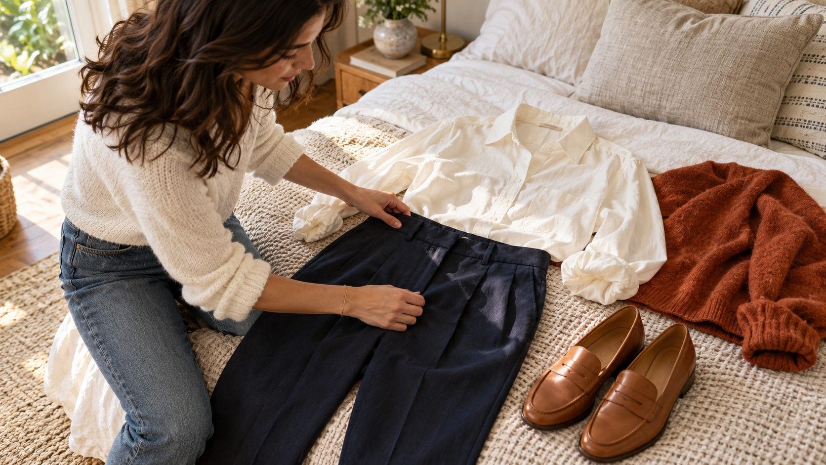
Choose the trousers, skirt, or jacket that already handles your workday well. Navy and charcoal are common starting points because they combine readily with many blues, purples, and pinks. Black can work too, although a black jacket with a brilliant white shirt creates a stronger contrast than a charcoal jacket with pale blue. Decide which effect suits the occasion and your preference.
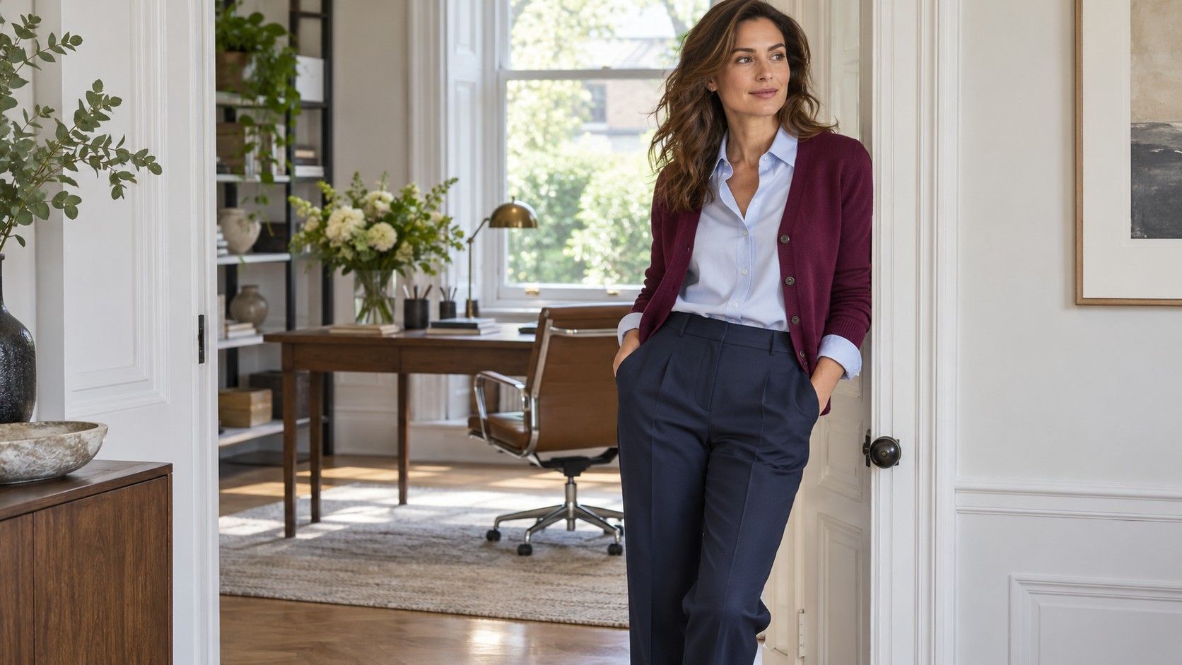
With navy trousers, try a pale blue shirt for a restrained combination, a raspberry knit for more color, or a soft gray tee beneath a matching jacket. These are different levels of formality as well as different colors. A crisp collar may work for a client meeting while a fine knit is more comfortable during a day at your desk. Check the actual office dress expectations instead of asking a color palette to make that decision.
A cool neutral does not need to match every other cool neutral exactly. Two near-identical navies can look accidental if one is noticeably faded or purplish. Compare them in daylight, then either choose a deliberate contrast, such as navy and gray, or use a coordinated suit when you want a uniform surface. Texture can make small differences look more intentional: a navy knit over smooth navy trousers has an obvious reason to vary.
When trying cool skin tone colors to wear to work, prioritize pieces near your face first. Replacing a cream blouse with a blue shirt may change the whole impression of an existing camel suit. Replacing the entire suit costs more and may solve no practical problem. Start with the smaller experiment.
Use blue-based accents without making every outfit blue
Blue-based describes a relationship between shades, not a requirement to dress in blue. A rose pink may look cooler beside peach, while a plum can look cooler beside an earthy brown. Compare real swatches or garments next to each other; names such as wine, blush, or teal cover a surprisingly wide range between shops.
Berry, violet, pine green, and cool red are worth testing when you want variety. A berry cardigan over a gray T-shirt makes a relaxed outfit, while a deep violet blouse can add interest to charcoal trousers for dinner. Neither combination needs additional purple shoes or matching jewelry. Repeating the accent once in a small print or accessory is optional.
| Outfit situation | Color combination to try | Adjustment if it feels too strong |
|---|---|---|
| Desk day with a navy base | Pale blue shirt and navy trousers | Use a softly textured shirt instead of crisp white contrast |
| Work dinner | Plum blouse and charcoal trousers | Try a more muted plum or an open gray layer |
| Weekend errands | Berry sweatshirt and medium blue denim | Reduce the accent to a scarf over a gray top |
| Casual evening | Cool red knit and dark jeans | Wear a navy jacket open to divide the red area |
Test the accent against your outerwear before committing. A violet top might be lovely alone yet awkward beneath the particular green coat you wear every day. You can still choose it for indoor occasions, but make that choice consciously. A useful purchase fits the situations in which you will actually reach for it.
Make weekend clothes softer through depth and texture
A cool palette does not have to look crisp or formal. Faded blue denim, a heather-gray sweatshirt, and a muted lavender tee can make an easy weekend outfit. For a deeper version, try dark denim with a pine-green sweater. The relative lightness of each piece changes the result as much as its temperature.
If pale pink or icy blue seems insubstantial beside your hair, move toward a medium-depth shade before rejecting the color family. Try rose instead of very pale pink, or denim blue instead of a nearly white blue. Conversely, if a dark purple hoodie feels heavy, compare a softer mauve knit. These changes give you a practical way to investigate contrast without assuming hair color determines what you must wear.
Fabric affects the mood. A blue satin shirt can feel dressy even with jeans, while a washed blue cotton tee feels familiar and relaxed. A marled gray sweater contains several tones that soften its overall appearance; a smooth dark gray shirt reads more uniformly. Look at the garment from across the room as well as up close, and choose for the effect you want.
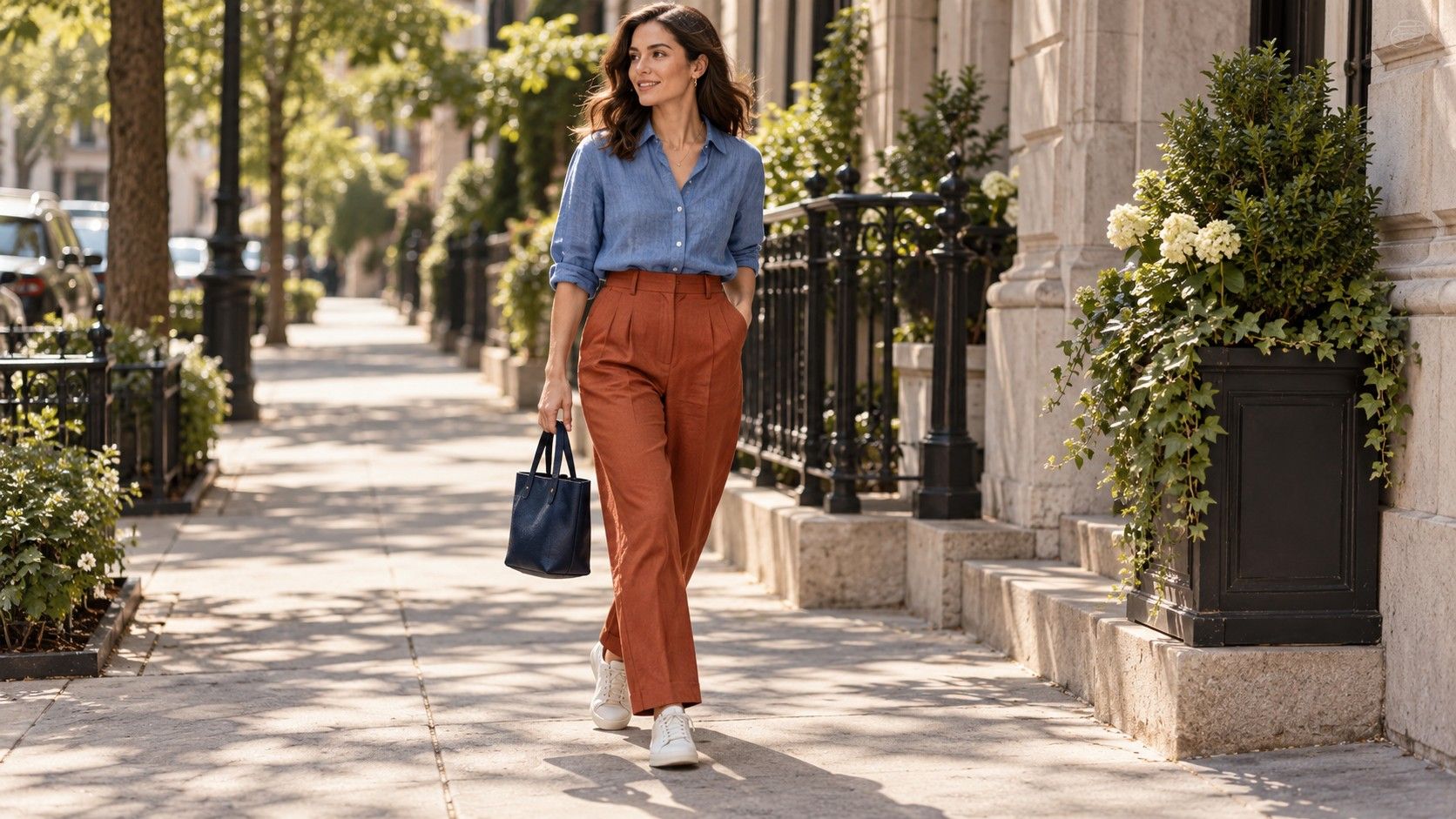
Keep footwear grounded in your plans. White sneakers, dark boots, or gray running shoes may already work with the whole group. You do not need to replace practical leather shoes because their brown color is warmer than your tops. Color harmony should help an outfit function, not make a wet-weather walk more complicated.
Wear a warm favorite with a face-framing layer
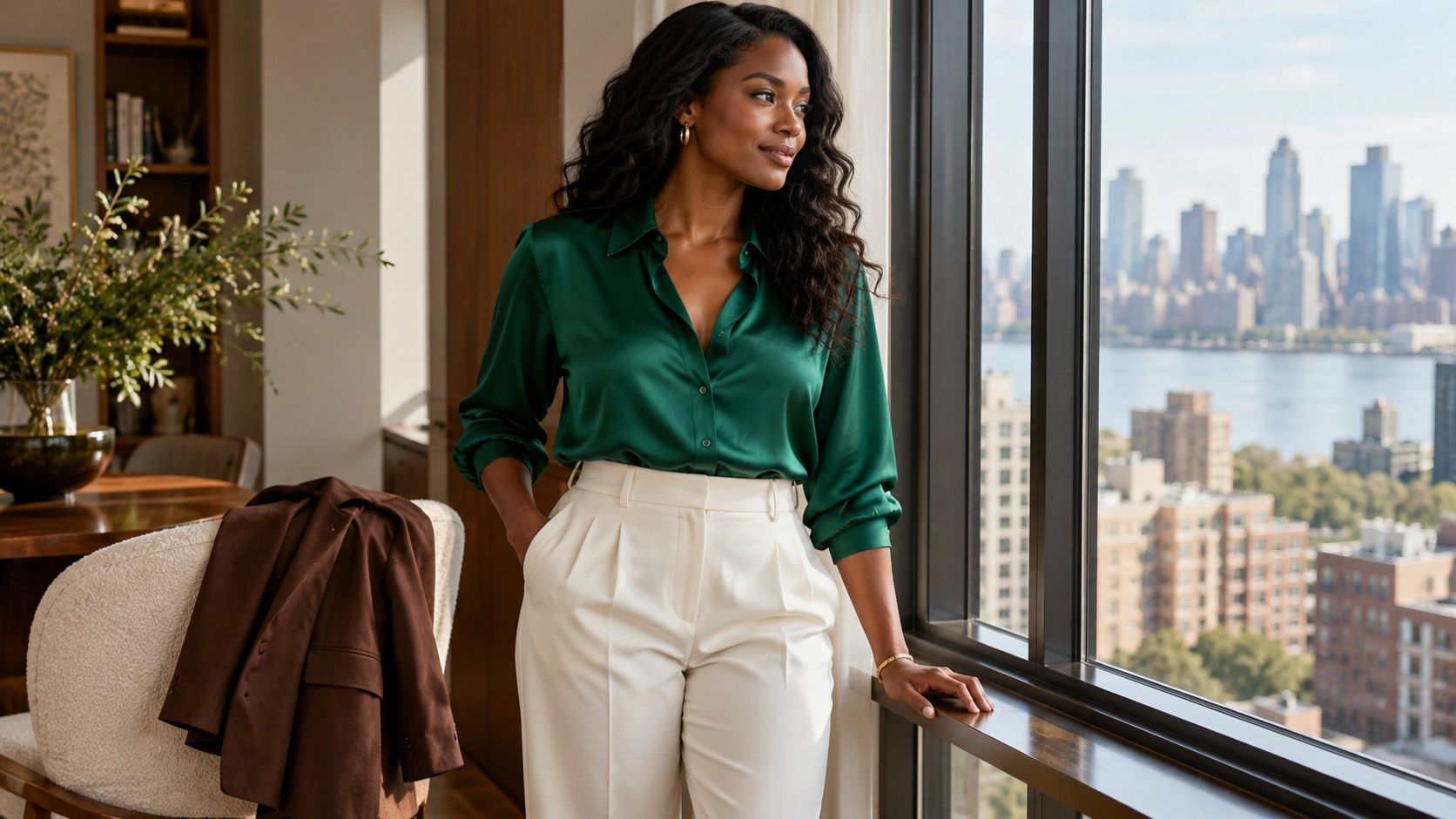
There is no need to exile a mustard jacket or a camel coat because you are exploring cool undertone colors to wear. Try a navy turtleneck, a gray scarf, or a blue shirt at the neckline. An open jacket creates separate areas of color, giving you room to enjoy the outer layer while adjusting the color immediately beside your face.
Use proportion to control the effect. A large cream scarf wrapped high around the neck occupies more space beside your skin than a narrow cream stripe on a blue shirt. If the scarf feels too yellow to you, a soft white or blue-gray replacement may be sufficient. The cream trousers farther down the outfit may remain a favorite.
Jewelry is another preference, rather than a definitive undertone test. Compare silver-colored and gold-colored pieces with the actual outfit and in the light where you will wear them. Finish, size, and surrounding fabric all change the impression. A small gold chain can be an intentional warm detail in a cool outfit; matching every metal is a styling choice you can make or ignore.
Check the whole outfit before ordering another color
Online color names are a rough guide. “Cool pink” might arrive peachier than you expected, and a blue-gray can shift under a warm bedroom lamp. If returns are available, keep the packaging while you compare the garment with two dependable pieces at home. Read the seller's current return terms before buying several shades to test, especially if shipping costs would make the experiment expensive.
For the final check, put on the complete outfit, including shoes and coat, and move away from the mirror. Sit down, open and close the jacket, and look at the neckline both ways. The small detail that felt distracting close up may disappear within a balanced outfit. Or the shirt you loved alone may bunch under the jacket, making fit the real issue.
Keep a short list of successful combinations instead of a long list of forbidden colors: navy with rose, charcoal with pale blue, dark denim with pine. A phone photograph can remind you of the pieces, although automatic white balance makes it unreliable for judging subtle temperature. Revisit the list when your routine or taste changes. The clothes should earn their place by being useful and enjoyable, whether or not their color name appears on a seasonal chart.