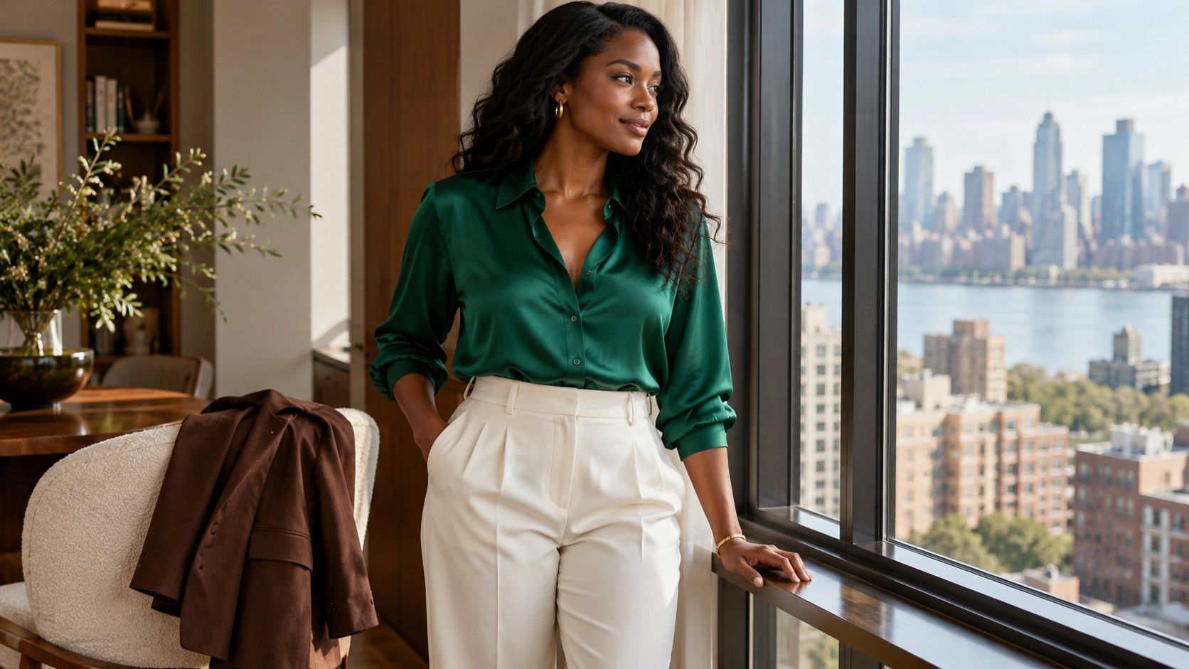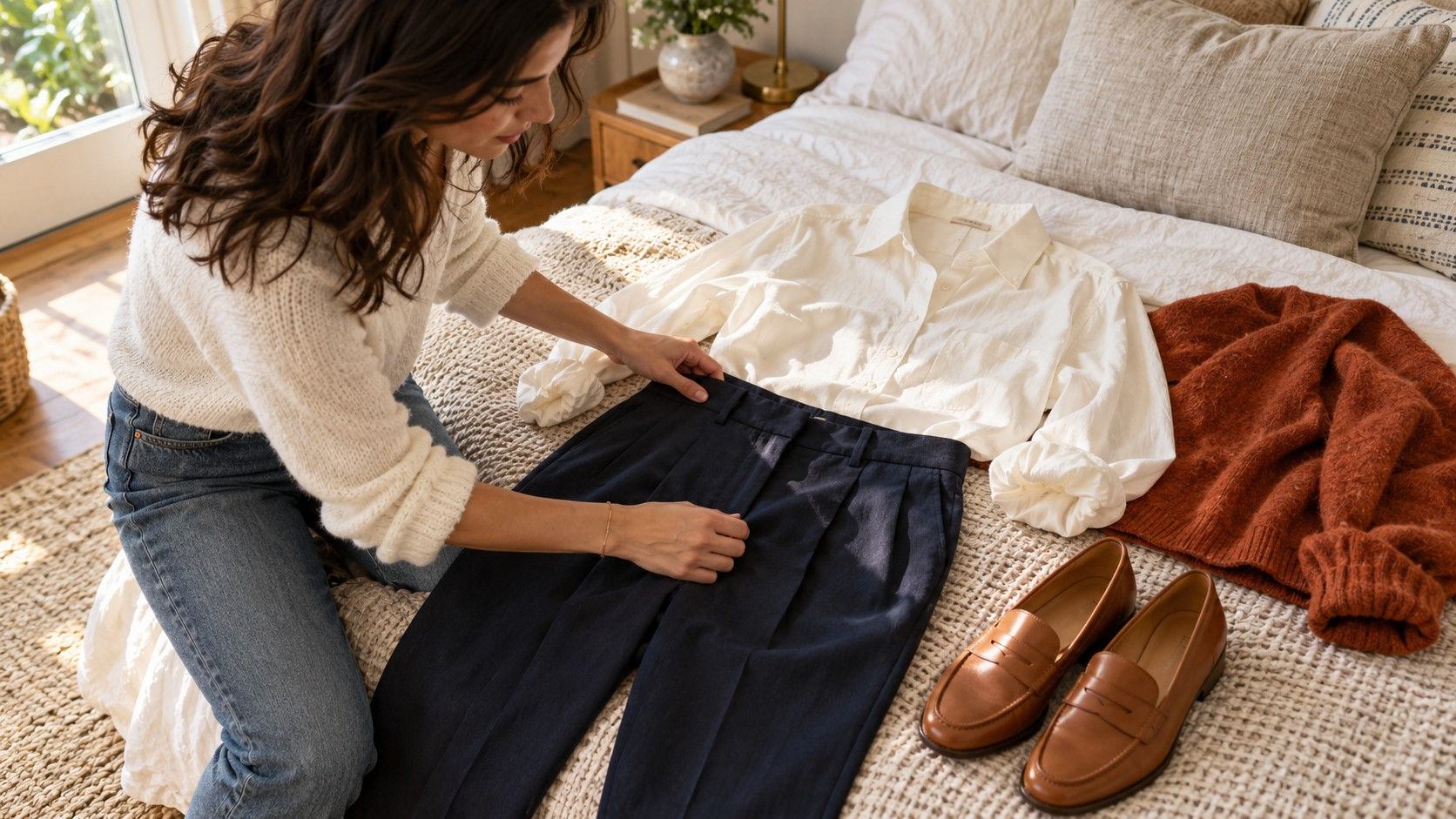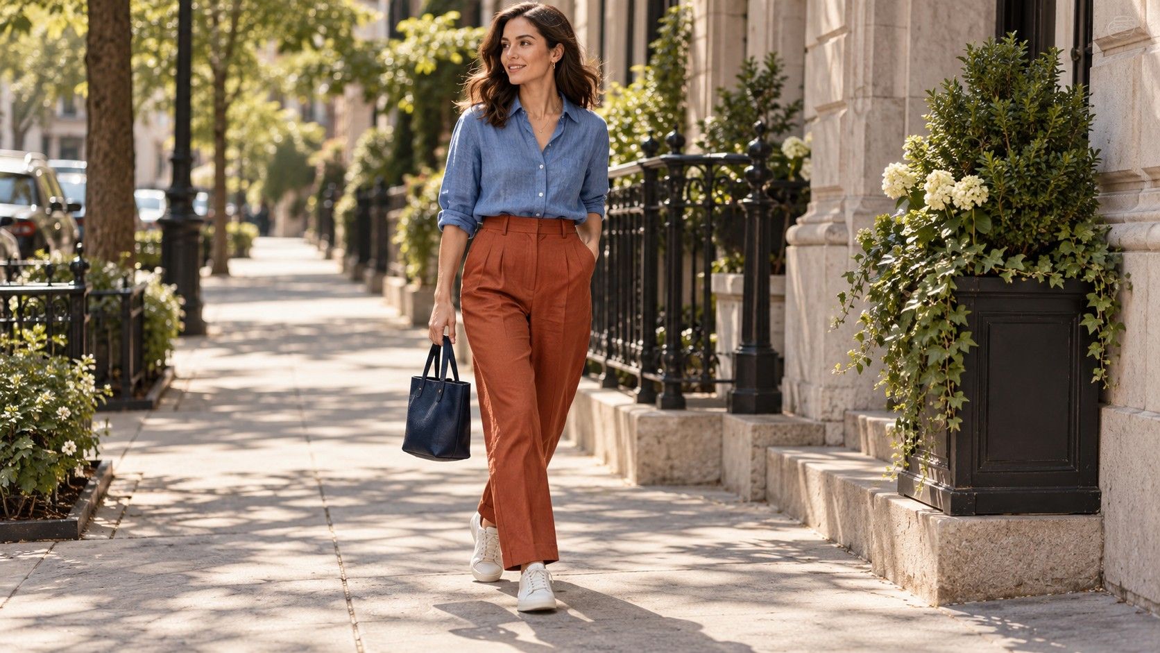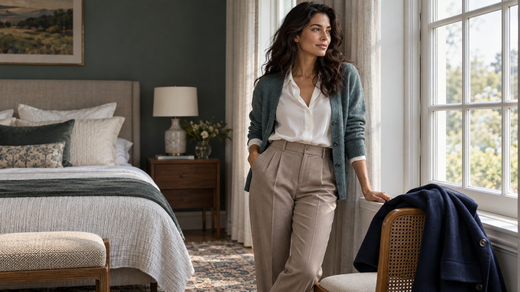
If warm and cool clothing both sometimes look good on you, the label neutral undertone may feel useful. It can also make shopping strangely vague: being told you can wear everything does little to help you choose a shirt. Use the label as a starting point for comparing real fabrics. A small set of reliable neutrals, a few colors you enjoy, and complete outfits for your week will do more than an enormous palette saved on your phone.
Separate the undertone label from the outfit decision
In personal styling, neutral undertones usually describe an impression that does not lean strongly warm or cool, or that appears to contain elements of both. These categories are subjective styling conventions. They are not a medical assessment, and a quick photograph or vein check cannot establish a wardrobe rule. Skin depth is a separate characteristic: neutral undertones can be discussed across a wide range of skin colors.
Choosing colors for neutral skin often comes down to a more specific decision: which white shirt goes with their face, whether a camel coat feels comfortable, or how to wear a favorite pink. Start with that question. A neutral label does not guarantee that every cream, gray, or orange will please you equally. Lightness, saturation, garment shape, and the surrounding colors all affect the result.
Choose one familiar outfit as a reference. Dark denim with a plain shirt is useful because you can change the shirt while leaving the rest alone. Put on your usual glasses and arrange your hair as you normally wear it. You are choosing clothes for your actual appearance and routine, so there is little benefit in constructing an artificial version of yourself just to satisfy a color test.
Compare two shirts in daylight, with one variable at a time
Stand near a window in indirect daylight and compare two tops of similar cut and fabric. Try a soft white against an ivory, or a slightly blue pink against a peach pink. Avoid comparing a shiny cream blouse with a thick charcoal sweatshirt and attributing the whole difference to undertone. Their texture, depth, neckline, and proportions are doing different jobs.
Look for an overall impression you like. You might prefer crisp white, soft ivory, or the way a shade connects with your hair. Note what you see without turning it into a diagnosis. A color does not need to make your skin appear lighter, remove every shadow, or hide ordinary texture to be a good clothing choice.
Check again under the lighting you use most. An ivory that feels gentle beside the window may seem yellower under a warm lamp. A gray shirt can look different in a bright office and a dim restaurant. If an outfit is for evening, the evening setting deserves a check. The daylight comparison gives you a consistent reference; it does not overrule the occasion.
Keep the test short enough to remain useful. After several shades, differences can become hard to judge. Select a preferred pair and wear the winner for a normal day. Comfort in real use is better evidence than repeatedly changing your mind over tiny shifts on a screen.
Choose balanced neutrals for the clothes you repeat
Begin with the items that carry your week: trousers, a jacket, everyday shoes, and perhaps a coat. Balanced neutrals might include navy, charcoal, taupe, soft white, or a brown that does not look strongly orange to your eye. The name on a shop label is unreliable. Two garments sold as taupe can lean pink and green respectively, so compare the actual pieces before treating them as interchangeable.
There is no requirement to build an entirely muted wardrobe. If black is your favorite base, keep it and test the colors beside it. A soft blue shirt can introduce a lighter area at the neckline; a cream cardigan can make the transition less stark. If you prefer low contrast, charcoal trousers and a medium gray knit may feel easier than black with bright white. Both are legitimate choices.
For a small working wardrobe, choose two main neutrals that already combine with your shoes. Navy and taupe may serve better than buying navy, charcoal, camel, black, and three different off-whites at once. Add one light top you like near your face. Wear these together before expanding. Wardrobe versatility comes from pieces forming outfits, not from the number of shades represented.
| Base in your wardrobe | Warm-leaning comparison | Cool-leaning comparison |
|---|---|---|
| Navy trousers | Ivory knit with brown shoes | Soft white shirt with charcoal shoes |
| Charcoal jeans | Muted coral top | Dusty rose top |
| Taupe skirt | Warm beige cardigan | Blue-gray cardigan |
| Black jacket | Soft peach blouse | Muted lavender blouse |
These pairings are comparisons to try, not a recommended palette for everyone with neutral undertones. Use whichever side you prefer, mix them when the clothes work together, or reject both. The table is most useful when it helps you notice that a warmer top can work with the same trousers as a cooler one.
Add color without buying a whole new palette
When looking for neutral undertone colors to wear, start with one hue you already reach for. If that is green, compare a muted olive, a cooler blue-green, and a clearer emerald using clothes you own or a small shop selection. You may find that depth matters more than warmth: two darker greens feel comfortable while a pale one feels disconnected. Record the actual shade, not just “green works.”
Blue, burgundy, muted rose, and teal are useful candidates because they appear in many everyday garments, but none is compulsory. Pair one with the neutrals already chosen. For example, wear a rose shirt with charcoal jeans and familiar black shoes. On another day, put the same shirt under a taupe cardigan. If it works in both combinations, you have found a practical addition rather than an isolated good-looking top.
Let a favorite difficult color occupy a different place. If a bright yellow shirt feels too forceful near your face, try yellow shoes or a bag with navy and white. You can also wear the shirt under an open jacket so less yellow is visible. These choices change the outfit's balance; they do not imply that your undertone forbids yellow.
Prints can bridge warm and cool colors. A patterned blouse containing dusty pink, soft cream, and charcoal already provides several connections. Repeat one of its quieter colors in the trousers and judge the whole outfit from a few steps away. A tiny print often reads as a blended shade at a distance. Check that overall effect before planning around a single thread you can only see up close.
Adjust contrast and finish when the color seems nearly right
A neutral undertone does not tell you how much light-dark contrast you want. Try a pale shirt with dark trousers, then a medium-depth top with the same pair. The first creates a clearer division; the second may feel more continuous. Consider the silhouette as well: an untucked pale shirt exposes a larger light area than the same shirt tucked beneath a dark jacket.
Texture changes the weight of a color. A glossy silver-gray top may draw attention more strongly than a matte gray knit. A fluffy cream cardigan can feel softer than a smooth ivory blazer even if their shades are close. When a color combination seems theoretically right but awkward on you, swap a fabric or layer before replacing the whole palette.
Jewelry offers another small comparison. Wear your usual gold-tone and silver-tone pieces with the actual neckline if you own both. You may prefer different metals with different outfits, or enjoy wearing them together. This is a styling choice, not a reliable test that assigns you to a permanent undertone category. Repeating the finish of a buckle or bag clasp can make the outfit feel connected if that detail matters to you.
Turn your best comparisons into three repeatable outfits
Build a casual outfit, a work outfit, and an option for a more dressed-up evening using the colors you liked. They can share pieces. Navy trousers might work with a soft white shirt for work, a teal knit on the weekend, and a rose blouse for dinner. Include shoes and outerwear in the check. A top that looks lovely in isolation may still need a coat or pair of shoes you do not own.
Photograph each finished combination for reference, understanding that a phone can alter color through automatic exposure and white balance. Keep short notes such as “ivory better with brown jacket” or “lavender good under charcoal.” Those notes are easier to use while shopping than an undertone label.
Before paying for another piece, identify two complete outfits it can join. Check the fabric in useful light, hold it beside an existing garment if possible, and consider whether you actually enjoy the color. Neutral undertones can give you permission to experiment across warm and cool families. Your best palette is the set of clothes you repeatedly choose, feel comfortable wearing, and can combine without starting again each morning.